Beyond Mnemonics: Making the most of Sonic Branding
Explore how Antfood helps brands like Netflix, YouTube, and Instacart evolve sonic branding, expanding memorable sonic logos to create dynamic sound ecosystems.
If you’ve been watching ads recently – and if you’ve been listening carefully – you may have noticed a particular audio trend, one that is relevant to the core of sonic branding. Sonic logos, or succinct audio cues that act as the auditory equivalent of a visual logo, are on the rise. These sonic cues are typically placed at the beginning or end of a piece of communication, usually accompanied by a visual logo animation. To those of us in the sonic branding world, the increase is significant and striking. Where ten years ago you might have heard a sonic logo occasionally from major brands like McDonald’s or Intel, now you are likely to hear as many as two or three in the span of one commercial break. While this uptick is hard to quantify, to those of us who are paying attention it is unmistakable, and it comes with major implications for how we think about, and utilize, sound.
“I’ve noticed the uptick in two ways,” says Steve Keller, who is one of the longest and most high profile advocates of sonic branding in the field and who currently works as Sonic Strategy Director at SXM Media’s Studio Resonate. “One is hearing more things come out in-market. But I’m also privy to conversations where a lot of brands are considering it more. With audio logos specifically, you’re hearing more brands just hopping on board.”
As discussed in the previous installment of this series, this uptick is influenced by several recent trends, including a boom of audio-first content driven in part by the pandemic, the durable popularity of smart speakers and voice activated devices, and the increasing emphasis on multisensory and immersive touchpoints. Another factor is the increasing sophistication of research tools to measure the impact of sound, particularly in the field of neuromarketing, which allow brands to gauge the gut level, System 1 responses that sound is so effective at eliciting. “I think brands feel a little safer when they know that they can do research and testing around things.” says Keller.
Sonic Logos themselves, however, are not new, and in fact represent the oldest form of sonic branding. The longest running sonic logo in existence, NBC’s three-note chime, has been around for just about 100 years, and originated as a cue that could help radio programmers synchronize content. Its three note melody, “G-E-C,” was inspired by the name of NBC’s parent company at the time, General Electric Company. Other “classic” sonic logos include the Intel Chime, whose melody is patterned off the phrase “Intel Inside,” as well as the McDonald’s “Im Lovin’ It” jingle, which was originally composed as part of a branded pop song by Justin Timberlake and Pharrell Williams.
These older sonic logos have one thing in common - they are all melodic, building equity in a specific pattern of notes. This is the most “tried and true” approach to sonic logos, and it comes with distinct advantages. Melodic sonics are easy to evolve and transform while still maintaining a recognizable core, as evidenced by the many ways the McDonald’s sonic logo has been reimagined over the years. A clear melodic hook can also be very sticky, and melodic sonics tend to outperform other kinds of sonics on measures of memorability.
However, melody is only one way to structure a sonic. HBO’s sonic logo, with its characteristic burst of static that gives way to an angelic choir, or the futuristic glissandos of the THX “deep note,” are examples of sound design based sonics, which lean into timbre and texture over melody and musicality. These sonics often have a future-forward, immersive or cinematic quality that is favored by tech and entertainment brands.
Then there are semantic sonics, like those for Playstation and Liberty, which explicitly verbalize the brand name or, in the case of Little Caesars’ “Pizza Pizza” mnemonic, something significant about the brand. These sonics, predictably, score highly on measures of association with the brand, and can be a useful tool when trying to reinforce a brand name or raise awareness for a new brand. Finally, there are symbolic sonics, or sonic logos that convey meaning without using words or language. HBO’s sound is a good example of this, with a structure that tells a story about the evolution from traditional broadcast television to a more elevated, prestige philosophy. This sound also illustrates the important point that these categories of sonic logo are not always mutually exclusive; HBO’s sonic is both sound designed and symbolic, and the McDonald’s sonic is both melodic and semantic.
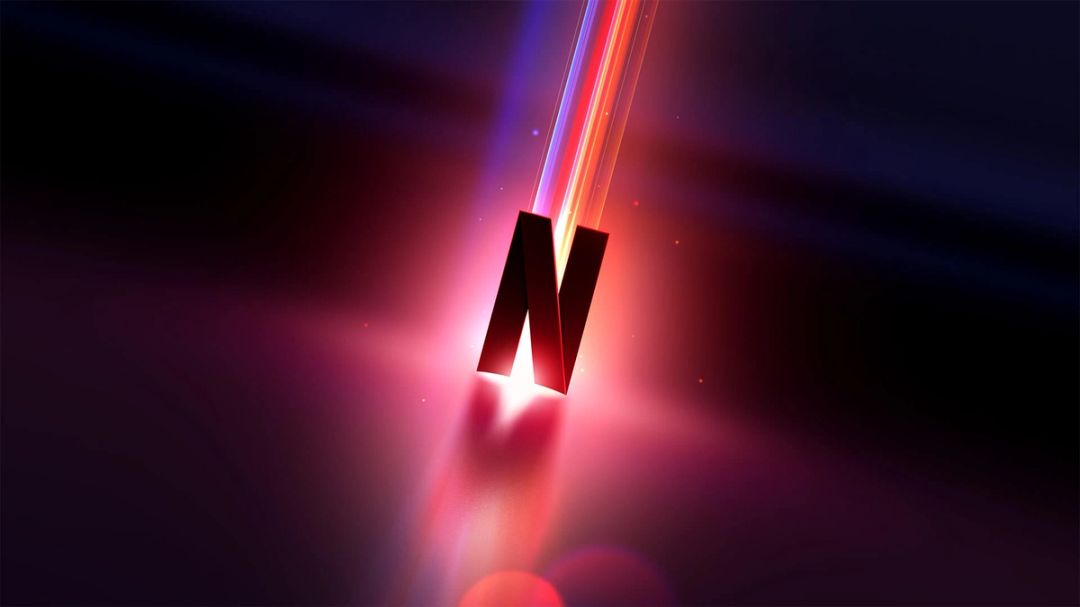
What all of these sonics have in common is a core structure, one that is instantly recognizable and can be imbued with equity through frequent and consistent usage. When done correctly, the impact can be massive. Netflix’s “tudum” is arguably one of the most recognizable sonic logos in the media landscape today–if you use the service, you probably heard it in your head when you read the word. The brand built equity in the sound by weaving it into their product experience and original content. By associating the sound with everything that makes Netflix special, they transformed it into a memorable calling card for their brand. Its core structure, formed from two percussive impacts followed by a “blossom” of processed guitar swells, gives the sonic room to evolve while retaining equity. When discussing adapting the sound for theatrical trailers on the podcast Twenty Thousand Hertz, Tanya Kumar, the Brand Design Lead at Netflix, said “Our tudum sound was extremely important. We didn’t want to mess with it. We wanted to make sure that that was the tie back to our brand and that we didn’t lose sight of something that our members and non-members really love.”
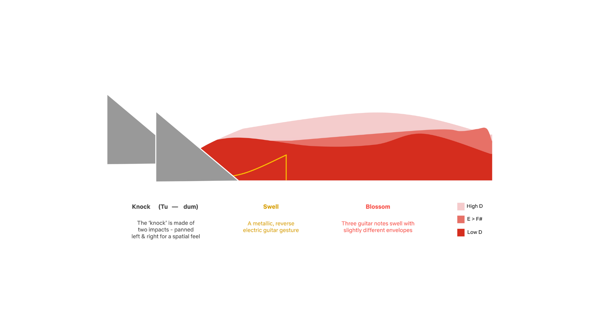
The Netflix Swell
While the brand had successfully created a memorable and ownable sound, and imbued it with equity, there was still one issue. Ultimately, a sonic logo can only be impactful when it is repeatable – optimized to be integrated successfully across touchpoints. In Netflix’s case, the original sonic was perfect for streaming pre-roll but not optimized for more strictly timed marketing communications. This created a situation where, despite being an iconic sound, the sonic had not maximized its potential reach among non-users. This led Netflix to task Antfood with the first ever update to the tudum – preserving the elements that made the sound so effective while expanding the sonic palette to create assets that could be leveraged for marketing and beyond.
“It was incredibly fun playing with such an iconic and identifiable sonic asset and extending that out to longer ambient menu beds, short transitions, impacts and accents — all while retaining the tudum’s valuable DNA.” says Wilson Brown, Executive Creative Director at Antfood. “In the end we built the package around a new, deeper and more organic impact that evokes the iconic Tu-dum’s deep impacts, while being more flexible, and a flutter of cellos inspired by the blossom. Additionally, we worked to build a sense of space through reverb and envelope, evoking not just a Red “N” but the entire universe surrounding it.”
Netflix - Behind the Sonic
So, we have established that a ownable, memorable and repeatable sonic logo can be a powerful tool for a brand. But as sonic logos become increasingly commonplace, the field will become increasingly cluttered, and breaking through the noise will become more and more difficult. With many sonics vying for listener attention, brands that play it safe will likely get lost in the mix, and unexpected sounds that break the mold will rise to the top. For YouTube’s first foray into sonic branding, Antfood created a unique and boundary pushing sound, referred to internally as “Buckle Up,” that defied conventions and expectations – so much so that we almost wondered if it was too much.
“YouTube had mentioned that traditional media often showed perfect versions of life, where YouTube showed a raw, honest and authentic view.” says Sue Lee, Executive Producer at Antfood. “When I heard “Buckle Up”, I could hear us going from that raw honest tone to a youthful tech finish. It was the perfect set of sounds being brought together – similar to how YouTube brings people together. I knew I had to push for this one.”
Sue’s instinct proved correct, and “Buckle Up” became the final YouTube sonic logo. The sound is designed to tell a story about the brand, with a bass drop that represents the “deep dive,” or the gravitational pull of a YouTube rabbit hole, followed by an optimistic melodic flourish that signifies the joy of discovery – all in under three seconds. This structure proved to be flexible enough to adapt for sub-brands, and Antfood developed a more vibrant and expressive iteration for YouTube shorts. Both sounds embody YouTube’s unique personality while breaking through the noise with a distinctive structure.
Youtube - Federal & Shorts
Creating more unique and distinctive sounds is one way that brands will compete for sonic branding equity. But perhaps the most important thing brands can do to stay ahead of the curve is to think about sonic branding more expansively, and to understand that sonic logos are really just the tip of the iceberg. After all, you wouldn’t limit your visual identity to just a logo – why would you do the same for sound?
“We’re starting to think more holistically, and I think where that’s taking us is to realize that branding is storytelling and experience. And when you think about it that way, Sonic Identity isn’t just throwing a Sonic logo onto the beginning or the end of a spot. Sonic identity isn’t the assets themselves.” says Steve Keller. “The pitfall is brands believing that, oh, we now have a sonic logo, the job is done.”
Indeed, when you think about it, there are many places that the typical brand makes sound – and many types of sound that they make. A cohesive, ecosystem-level approach to sound can greatly improve the quality of brand messaging and heighten the overall experience of interacting with a brand from the perspective of a consumer, viewer or user (a subject we will explore more deeply in later installments of this series.) This doesn’t mean a sonic logo isn’t important – in fact, a sonic can be a great jumping off point for a larger sonic identity.
For Instacart, Antfood created an expansive sonic ecosystem that began with a sonic logo before branching out into music, UX, voice, and haptics. By starting with a unique and vibrant sonic, we were able to crack open the door to a larger universe of sound, one that had implications for every sound touchpoint. As with YouTube, it all started with a creative risk, in this case a sonic logo with an off-beat composition and a uniquely surreal tone.
“Like most people, I love to feel the world between my fingers and toes, share delicious food with loved ones, explore, take it easy, and breathe.” says Rory White, Antfood Composer. “There was a unique opportunity to translate that savoring of life into sound for Instacart. We got there with a sonic featuring a tasty harmonic resolution using unexpected chords from outside the key, a relaxed whistle melody, mmm-ing vocals, layers of swung and warm textures, along with some other fresh ingredients.” These elements combined for a bold sound with a distinctive quality, designed to cut through the media landscape and signify what makes Instacart a unique brand.
Instacart - Mnemonic
Despite its brevity, the Instacart sonic logo turned out to be a fruitful wellspring of inspiration. Its eclectic influences, borrowing elements of jazz, hip hop and electronic music without being overly genre-specific, gave us an entrypoint to create a distinctive and dynamic musical aesthetic brand, one that used mashup culture and remixing techniques as a tool to synthesize disparate influences into a cohesive aesthetic. Tactile and percussive elements in the sonic, including a “pop” derived from the sound of a real carrot being snapped in half, ended up taking on a life of their own as UI sound elements in both the Shopper and Customer experience. By weaving elements of the sonic throughout a wealth of musical and sound design assets, we were able to create a sonic ecosystem that is both expressive and functional, while consistently reinforcing the Instacart brand. All based on one three-second asset.
So where does all this leave the sonic logo in 2023? A powerful tool for equity and memorability, yes, and a great starting point for getting into sound. But as more and more brands tip their toes into sonic branding, and more and more sonic logos enter the public consciousness, it will become increasingly difficult for sonic logos to cut through on their own. Fortunately, the same thoughtfulness that is used to create sonic logos can be applied throughout a brand’s entire ecosystem, with implications for music, UX sound, and much more. It is on these more expansive fronts that the sonic brands of the future will compete and innovate.
About the author
Colin Coogan, Senior Creative Strategist at Antfood has over 10 years of experience in sonic branding. A lifelong musician, he leverages knowledge of psychology, brand strategy, and music to build comprehensive sonic identities and experiences. He lives in Brooklyn with his fiancé and two unusually large cats.
